Demos
Basic
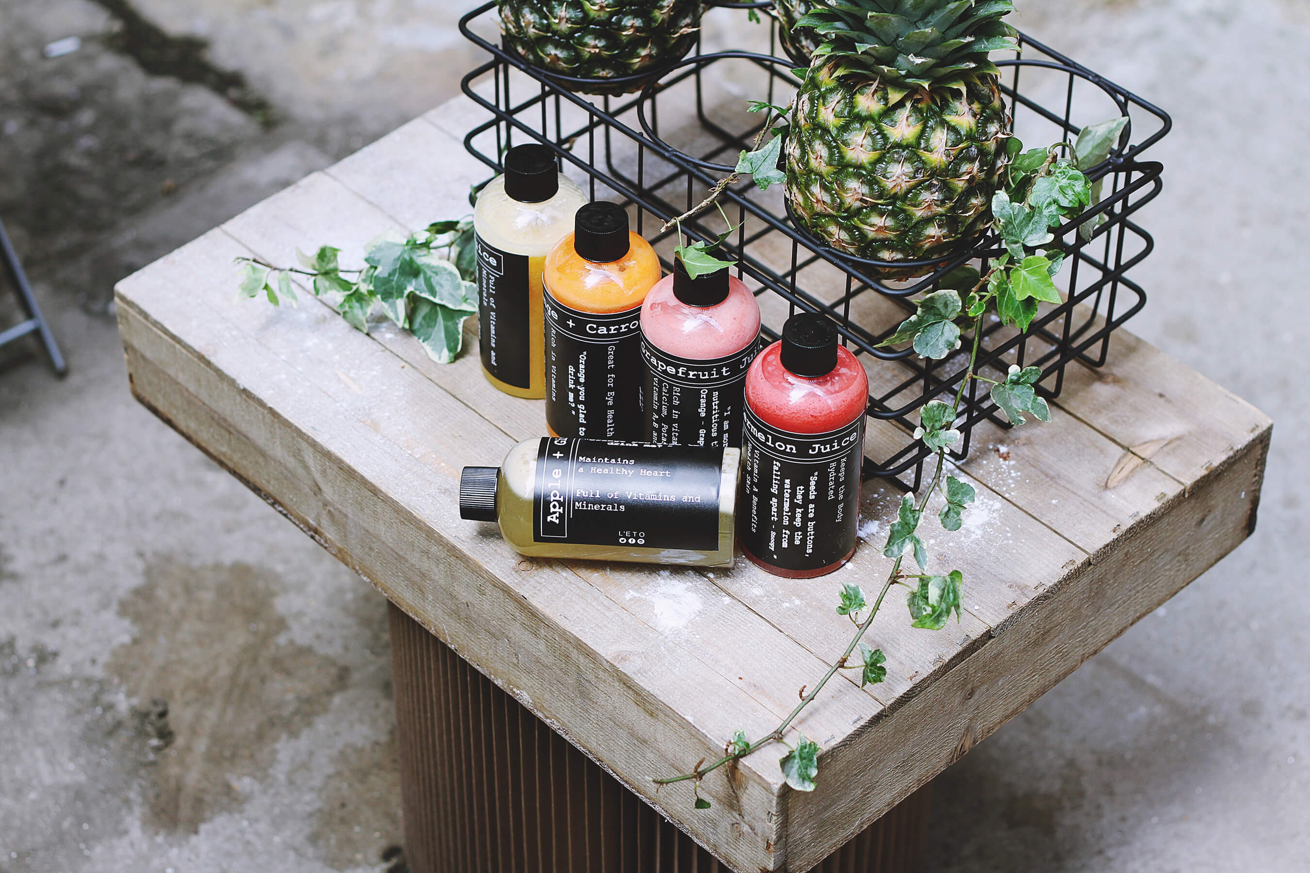
Notes:
- Simplest use case with only src prop set
- Try Basic Demo on CodePen
- Photo credit: Toa Heftiba on Unsplash
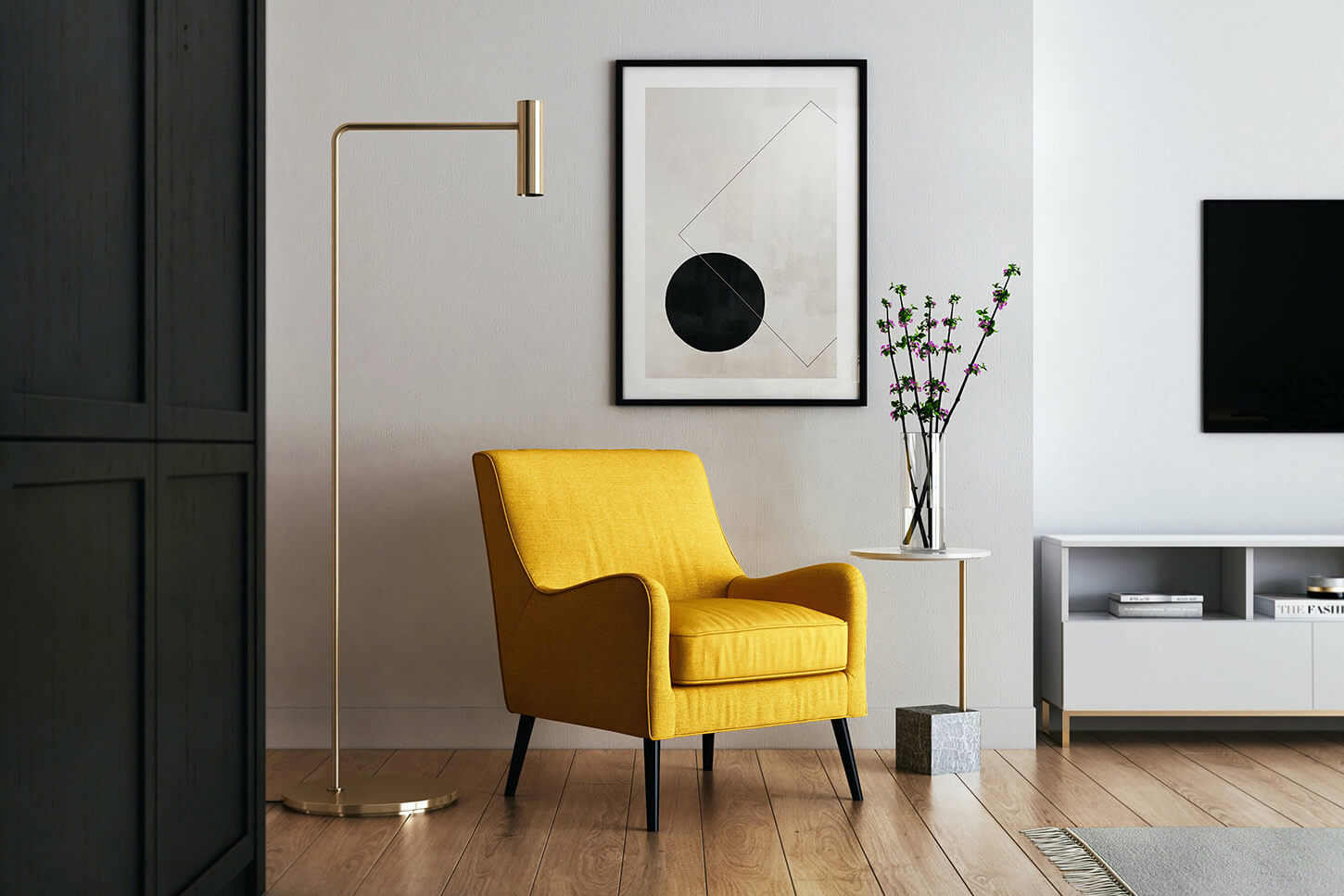
With Loading Spacer

Notes:
- Uses width and height props to generate image aspect ratio
- Creates an image spacer to prevent cumulative layout shift
- Try With Loading Spacer Demo on CodePen
- Photo credit: Mel Poole on Unsplash
Drag To Move

Notes:
- Drag to explore zoomed image on non-touch devices
- Click to zoom out
- Try Drag To Move Demo on CodePen
- Photo credit: Curology on Unsplash
Fullscreen On Mobile

Notes:
- Zoomed image is fullscreen on touch devices below a specified breakpoint
- Try Fullscreen On Mobile Demo on CodePen
- Photo credit: Rachel Park on Unsplash
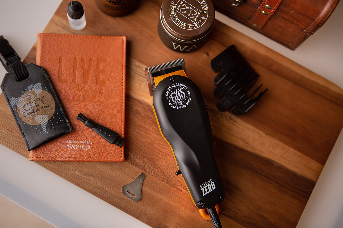
No Close Button On Mobile
Notes:
- Hides the close button on touch devices
- Zoom out is triggered by tap
- Try No Close Button On Mobile Demo on CodePen
- Photo credit: Kam Idris on Unsplash
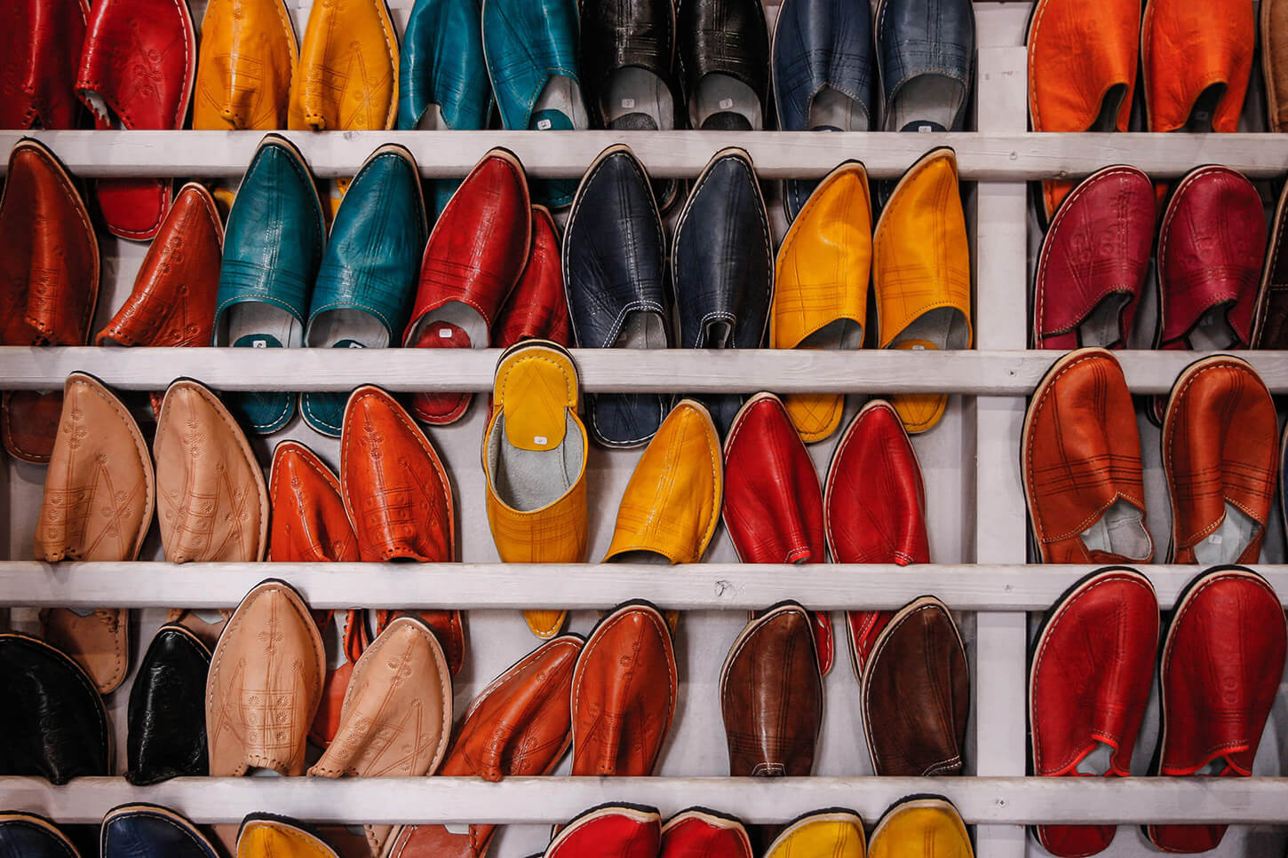
Responsive Images

Notes:
- Accepts default srcset and sources (with srcset, media, type)
- Use with Picturefill for older browser support
- Try Responsive Images Demo on CodePen
- Photo credit: Brittany Neale on Unsplash
With React Lazy Load
Notes:
- Integration with React Lazy Load
- Try With React Lazy Load Demo on CodePen
- Photo credit: Becca Tapert on Unsplash
With Slick Carousel
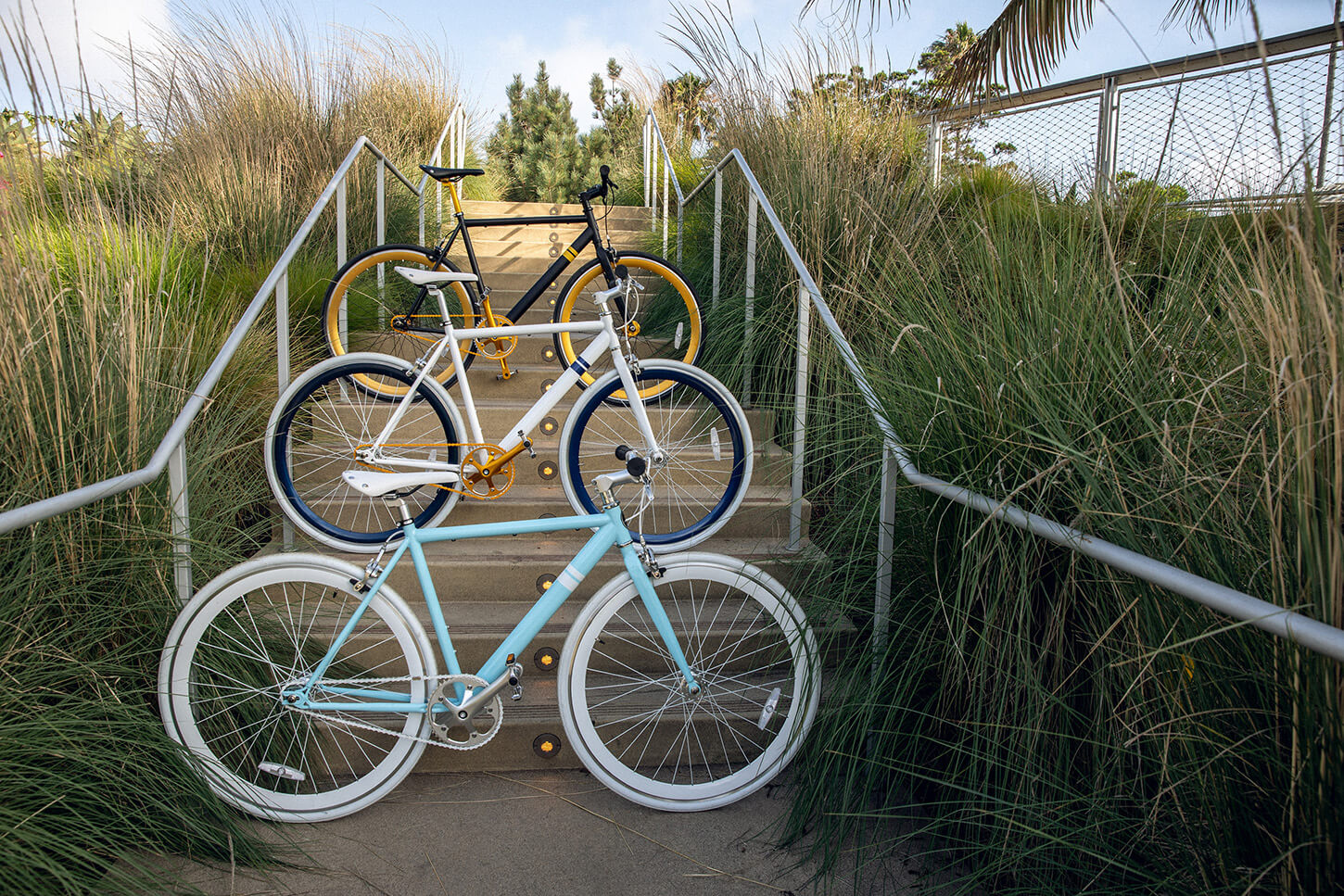
Notes:
- Integration with React Slick
- Recommend using with fullscreenOnMobile
- Try With Slick Carousel Demo on CodePen
- Photo credits: Martin Adams, Andrea Donato, and Solé Bicycles on Unsplash